August Devlog
Hallo! Time for the August wrap-up!
Ramble
Man, somehow August slipped away without me realising. Last time I looked, we were a week away from the update. Then I blinked and September ambushed me like a dang weeping angel.
What the heck.
Anyway. Lots of stuff this month. Let's jump in.
Summary
- Finished a full play test of Yren's route
- Finished a full play test of Raif's route
- Finished a full play test of Noel's route
- Finished a full play test of Kav's route
- Write bonus scenes for Ch1
- Created recap screen for the demo content
- Created Yren's Ch2 CG
- Created Noel's Ch2 CG
- Worked on coding sprite expressions Ch2
- Coded Wil
- Noel
- Raif
- Yren
- Kav
- Received new BGs and sketches
- Worked on CGs
- Added flowcharts
- Added affinity indicators
- Added Sprite colouriser
- Added CG gallery
- I think that's it??
Writing
Fun fact. Due to my edits during playtesting, the script is 622,000 words now. LoL These are mostly edits from adding in additional choices and choice options where needed.
Artwork
Received new BGs and BG sketches, of course.
Have done some CG work but I honestly don't remember if I had Yren's done last time. It's done now. And Noel. So yeah.
Other
LOTS of working on features this month. I have been continuing my personal play tests for fix continuity and stuff like that and have been coding sprite expressions through chapter two. It's a lot of content and I have a lot on my to-do list. So I'm not done with either of those things yet. But I have still managed to get a lot done this month.
Most of the big features I've worked on, I had significant help from my friends Windchimes of Wind Chimes Games and Feniks. I want to really credit them for helping or in some cases basically just doing the entire basic set up for for me. Ha ha. And for their endless patience with my dumb questions because I'm not an adept coder by any means.
Affinity indicators are one of the features. When you make a choice, you can click to see this. It does not pop up automatically which means that if you don't want hints, you can ignore it.
(uh. There are funny achievements too. Some of which are Easter eggs and references to other things. If you get this reference then you get a cookie. LoL)
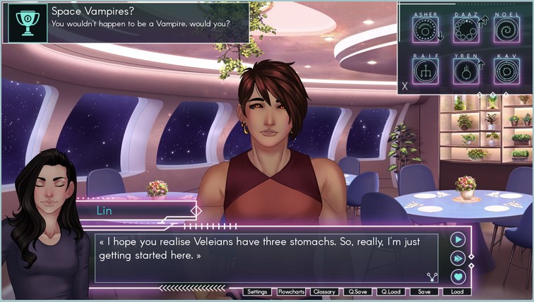
I went through and did all the scoring up through chapter 5 to test the affinity indicators and also to be able to test that getting onto the routes works correctly.
Skin tone slider is FINALLY in the game. Whoo hoo. This means that instead of three skin tones you get a whole slider worth of them. Huzzah!
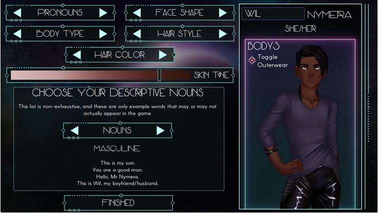
To that note, the CG gallery is also now coded. Which doesn't seem that impressive but with character customisation it's a little more involved to set up the CG gallery so that it displays the skin tones correctly.
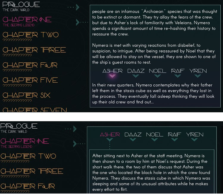
The recap screen is now complete. I didn't mention it in my last update so it doesn't look like it was done at that time. This screen is accessible from the title screen and when a new episode comes out, you'll be able to go here and see summaries for the previous chapters to refresh your memory if you need.
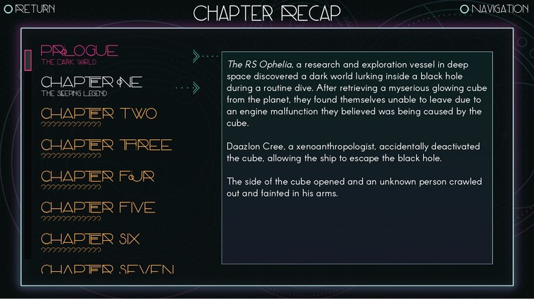
The individual characters are behind additional cuts which means if you haven't played through every character's content you can choose who to read summaries for.
The really big thing I'm working on right now is...flowcharts. Feniks has been working on a flowchart plug in for a while. This plug in is a completely different approach to making flowcharts than what I used in the past. We had talked a little about flowcharts back when I was working on Gilded Shadows and that went into discussing them building a flowchart plug in for me for When Stars Collide.
This flowchart would have some different functionality than Gilded Shadows and be constructed quite differently. In GS, I had to build the flowcharts in photoshop or somewhere, then code those into the game as image maps.
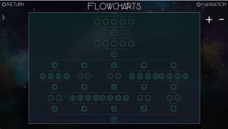
This flowchart is built almost entirely in the code. The modules had to be created and imported but I don't place them manually. They get coded manually but aligned and connected automatically with the plugin. As you can see, you are able to zoom in and out.
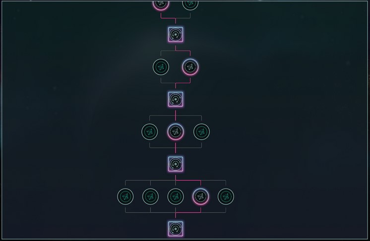
The flowcharts in WSC get so bulky at times that it was pretty difficult to decide how to format them. It's all good and well when you're in a narrow section but when you get to one of the LI scenarios where each LI then has a four option choice, the chart gets really wide. And one of my struggles was that with the player only able to see a small portion of the chart at a time, you really couldn't get a sense of your overall path through a chapter. Being able to zoom out to see the entire chapter helps with that.
I'm really happy with that aspect of this.
When you hover over a module, you do get that little tooltip telling you what the module is for. Because these charts do get so bulky in places, I needed to keep the nodes quite small. Which meant having the tooltips was the most efficient way to to label them.
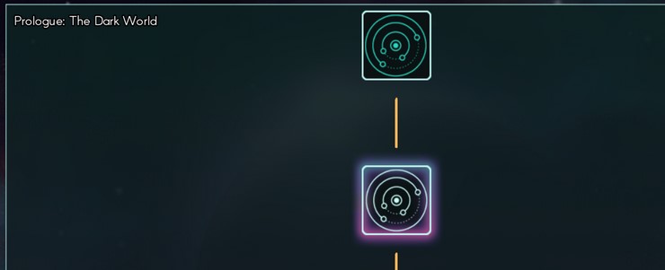
One of the other cool things about this chart is that it distinguishes the path you've never seen (grey), the path you are currently on (pink), and paths you've seen before already but aren't currently playing.
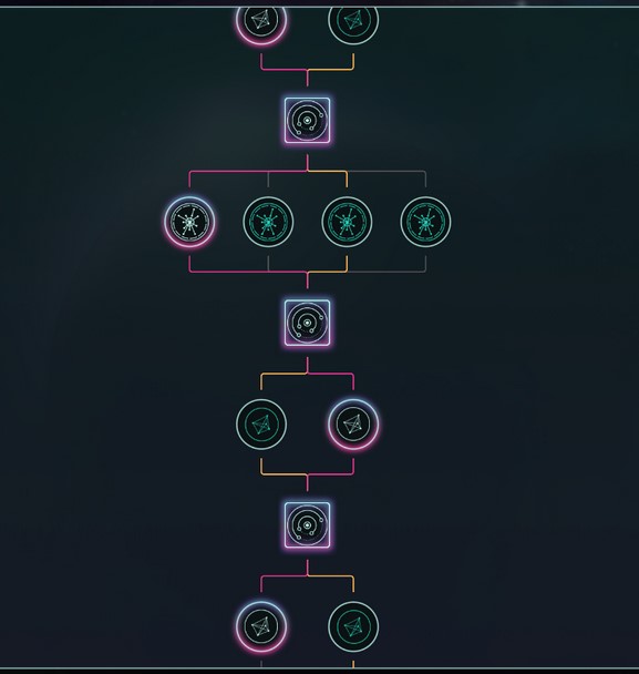
So yeah, I'm still getting the flowcharts set up. I only have chapter one built and am now going back to place the "unlock" statements in the chapter. Then I have to build the flowchart for chapter two. And the screen itself still needs some functionality added but it's really great to have this plug in in the game now.
Upcoming month(s)
My to-do list has dwindled significantly over the last month but I do still have a few outstanding things to complete before I can release the beta of the first episode to Patreon.
- Complete CGs
- Complete Cim's sprite
- Complete sprite expressions
- Complete flowcharts
- Complete playtesting
Ideally I would be able to get the bonus scenes coded but I don't actually consider that 100% necessary for beta.
I don't want to give an ETA on that Patreon release because really, everything with this game is taking longer than I expect it to. But you can see that we're getting there.
Most of the features have the frameworks in the game now. I just have to implement them fully through the chapters. And get some remaining art assets squared away.
Anyway, that is it for this devlog everyone. I shall see you next month.
*crawls back to the dev cave to code sprite expressions for the next 12 years*
Get When Stars Collide
When Stars Collide
A science fantasy romance adventure.
| Status | In development |
| Author | Steamberry Studio |
| Genre | Visual Novel, Adventure |
| Tags | Amare, Character Customization, Cyberpunk, Dating Sim, Fantasy, Otome, Sci-fi, space-opera |
| Languages | English |
More posts
- January & February Update45 days ago
- December and Year End Wrap-upDec 31, 2025
- Chapter 10 (Episode 7) is out now!Dec 16, 2025
- November Update and DevlogNov 30, 2025
- October DevlogOct 25, 2025
- September Wrap-up and DevlogOct 01, 2025
- Chapter 8 and 9 are out nowSep 26, 2025
- August UpdateAug 26, 2025
- Chapter 7 Update is Here!Aug 07, 2025
- July Devlog/UpdateJul 25, 2025
Comments
Log in with itch.io to leave a comment.
I am so looking forward to this!!! Honestly, your visual novels are the best I have read. Your stories just pull the reader in. You're an incredible writer.
Thanks for the updates!
you never cease to amaze me!! throwin all the bouquets at you! <3
╰(*°▽°*)╯ *tries to catch the bouquets*
Hell yeah!!! I'm always so excited for all of your games. Genuine masterpieces within the visual novel field <3 great job with the crazy amount of updates omg
(´▽`ʃ♡ƪ) Masterpiece feels too generous but thank you for the encouragement! =D
nice job!!! congrats on all the work done!!
Thank youuuu. (~ ̄▽ ̄)~
You've made incredible progress Esh!! It's so exciting to see it all coming together ✨
Couldn't have done it without youuuu. (☆▽☆)
So much accomplished! :D
It is a lot. Somehow it felt like less. Ha ha. The months are going by so fast.
(┬┬﹏┬┬)
Just wanna say that every time I read one of your dev logs my respect for you shoots through the roof all over again.
Have fun in your dev cave, hope it's comfy 😊
╰(*°▽°*)╯ The dev cave is definitely cosy!
From an art viewpoint was the skin tone slider difficult to get working and have the result look right? I can imagine different skin tones have different highlights and undertones that need to be changed with the slider as well, did you have to simplify the colour style for the MC to make it work?
Hi Lance.
So to explain the art, Wil's sprite is coloured in greyscale. The dynamic colouriser Feniks made uses RGB channels to help increase the flexibility of the tool. This means I can use a red channel, for example, to add a rosiness across certain areas of the sprite to increase the depth of the shading.
Fen and I played a lot with my sprites and art when they were developing that tool to see how close to my original colouring style. And we were both sometimes astonished by how close it can get. It is a really phenomenal tool.
I can set some defined skin tones that have a range of swatches correlating to the different levels of shading on the greyscale sprite. These are, in my case, based on the fully rendered skin tones that I did previously.
I defined 5 different skin tones, each with this full range of shading and then the slider extrapolates the in between skin tones.
In my case there was a lot of tweaking of the art to figure out how to best set up the files for the colouriser.
It gets a little more complex when you have something like a smiling mouth where the lips need to get recoloured but the teeth do not. So you end up with a sprite file that looks like this:
The blue channel is adding depth to the lip shading and the green channel is keeping the teeth white.
Once I figured out how the colouriser was going to affect my art, then from an art standpoint it wasn't actually hard because you're just colouring in grey scale. Then adding these red, green, and blue elements for coding purposes. And honestly, for me, shading in greyscale is pretty simple.
The difficulty in the colour slider was really testing swatches (which wasn't difficult per se, but was a little time consuming until I got the hang of it - like any new tool) and the coding itself as far applying the colourised art to a sprite, then CGs, then a gallery.
And I think the coding was harder for me because frankly, I'm a very low level coder. Windchimes helped me with it and was subsequently traumatised by those bright green teeth. 🤣🤣
That's super interesting, thanks for the in depth reply!